Apple makes small changes to Safari redesign with the latest iOS 15 beta - TechnW3
What you need to know
- Apple has made some UX changes with the third iOS 15 beta.
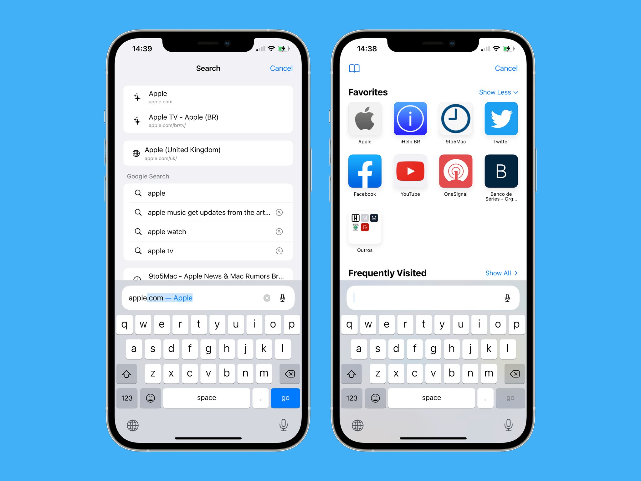
- The search bar stays above the keyboard and search results are more clear.
Apple appears to be taking action on feedback about its new Safari design.
Apple seems to be listening to feedback about the new Safari experience on the iPhone with iOS 15.
Earlier today, Apple released the third beta of iOS 15 to developers. As spotted by 9to5Mac, the previous beta of iOS 15 would move the search bar for Safari to the top of the display once you began typing out a search request. With the latest beta, the search bar stays just above the keyboard. It has also made changes to make the results more clear.
The updated Safari interface in the third beta release of iOS 15 makes this experience more coherent, although not exactly what several users were expecting. Now when you tap the address bar on the iPhone, it remains at the bottom of the screen just above the keyboard.
Apple has also updated the list of results shown on the screen, which now makes it clearer which websites are from web searches, favorites, or your personal history. However, for iPad users, there are no noticeable changes to Safari with the third beta of iPadOS 15.
When Apple announced iOS 15 at WWDC21, it revealed a major redesign to Safari across the iPhone, iPad, and Mac. On the iPhone, the search bar was moved to a floating position towards the bottom of the screen. Apple said that this would make it easier to get to search - a reasonable idea since iPhones continue to get bigger.
However, some users have complained about the change, saying that it is too radical. With the latest beta release of iOS 15, Apple appears to be making some tweaks in response to user feedback. Hopefully, everything will be tightened up when the software releases to everyone in the fall.
from iMore - Learn more. Be more.
via TechnW3


No comments: