Plex for Apple TV gets a whole new interface and new customization options - TechnW3
What you need to know
- Plex for Apple TV now has a new interface with additional customization options.
- Users can choose new layout options and more.
Plex now looks better than ever on Apple TV.
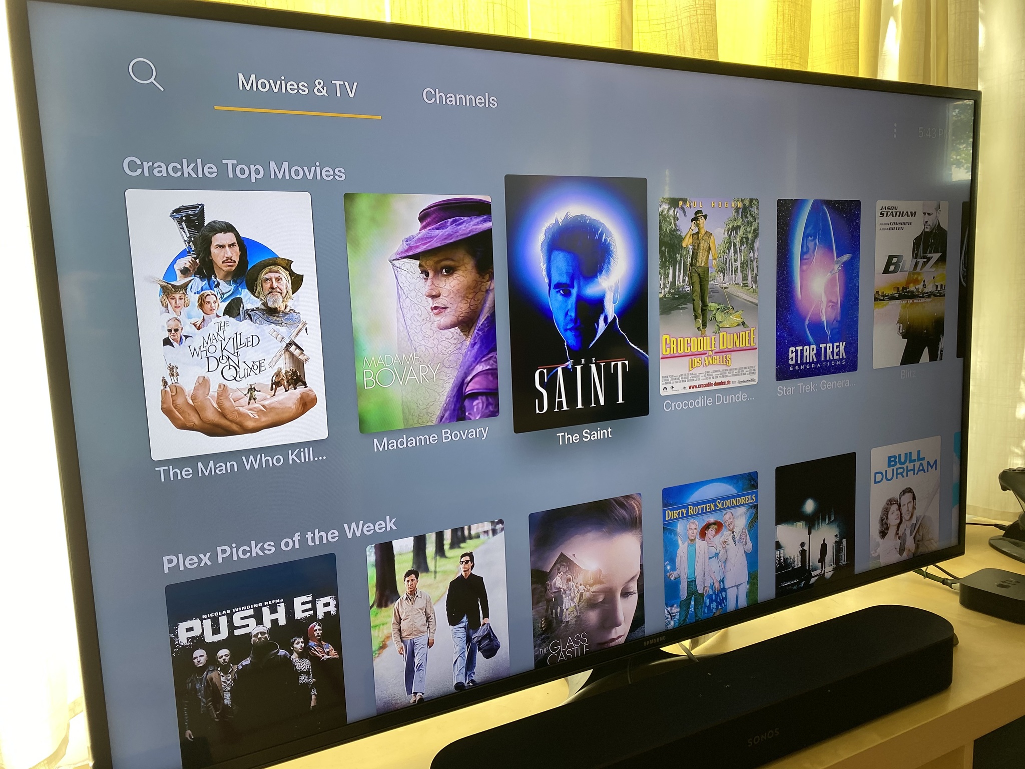
Popular media jukebox app Plex has released an updated version of its Apple TV app, complete with an overhauled interface. Users can now customize the way the app looks in ways that weren't previously on offer.
Plex made the new interface announcement in a blog post and said that it set about creating the new interface by asking people what they wanted — something that was important given the number of different types of users the app has.
So how do we ensure we offer the best experience for as many of you as possible? And build a dynamically responsive system that pulls visual styling from millions of different pieces of art? Turns out, the solution was not something we could pull off all by ourselves. So we got a little help from our friends.
The new interface is more customizable than ever, giving users the chance to opt for a new 'Modern' layout that displays artwork and "inline" details on some Home screens. But there are more options, too.
Content Layout: This setting controls the layout used to display your content. Okay, so before you say "No, duh!", this setting also controls whether "inline metadata" is displayed on the homescreen and the poster is displayed on detail pages.
- Modern (the default): Displays artwork and "inline" details about the title on some screens when focused on a poster. This layout also prefers background artwork over posters on title detail pages.
- Classic: No "inline" metadata is shown, displays title and additional information below posters, and prefers posters to artwork on detail pages.
App/Home Background: This setting allows the user to select the base background of the app (i.e.: the background used for the home screen, settings, etc…).
- Artwork Colors (the default): Applies colors from the current title's artwork to the background and gracefully (we hope!) transitions the colorfield as the title selection changes.
- None: Displays the default background for the application (dark gradient).
Details Background: This setting controls the background displayed on the detail pages for items.
- Artwork Colors (the default): Utilizes colors from the title's artwork within the background on title detail pages.
- Dimmed Art: Displays a full screen, dimmed version of the background artwork on detail pages.
- None: The default background for the application is used for detail pages (dark gradient).
The best way to see what Plex has been working on is to download it and try it for yourself. You can grab the newly updated Plex from the App Store now. It's free, and is one of the best Apple TV apps you can find.
from iMore - Learn more. Be more.
via TechnW3


No comments: